Tuesday, May 17, 2011

Live Painting in Illustrator

We've been learning Live Tracing and Live Painting in Illustrator CS5. Here's my try on it.


I got this montage drawing on the internet, and it was rasterized...


1. Open a new document in Illustrator, and place the file onto it.

2. Go to [Object] --> [Live Trace] --> [Tracing Options]

3. Adjust the tracing options until it looks the way you want.

4. After adjusting tracing options, select the image, go to [Object] --> [Live Paint] --> [Make]

5. Since I want to color it, so I need to close up the small gaps. Go to [Object] --> [Live Paint] --> [Gap Options] --> [Close gaps with paths]

6. Open [SWATCHES], then open [Swatch Library], choose the color palettes you want.

7. Get the Live Paint Bucket to fill in the areas with the color you want.


FINAL:


Sunday, May 15, 2011

Second Part of CD Cover

This is the second part of the CD cover I have been doing. I saved the previous part as PSD file, and place it in Illustrator. Now I am going to render the type in Illustrator. 


1. Type in the the text.

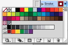
2. Go to "Window", open the "Appearance" panel.

3. Adding new stroke by clicking the black square box at the lower left corner of the panel.

4. Change the color of the stroke by clicking on the arrow.

5. Go to "Window", open "Brush Libraries," select any kinds of brush you want. You can add as many stroke as you want to the text with different colors and point sizes. 

FINAL:

Thursday, May 5, 2011

First Part of the CD Cover

This time, I decided to do a CD Cover for my favorite Japanese artist, Miyavi. So I figure out, instead of creating a story-like cover, a cover with wild watercolor splash fits more into his character. And here we go...


1. Open a new document. Set a gradient overlay background.

2. Experience with different brushes with various sizes, flow, and opacity.

3. Select his upper body out with quick selection tool, and then drag him on top of the brush layers.

4. Add a Hue/Saturation and a Curve adjustment layers as clipping mask to create contrast.

5. Add some more strokes around the body and head.

Here's what I got so far, and I'll add some more vector components and type to it later on.

Friday, April 22, 2011

Birthday Girl

There's a story behind this picture...It happens on the birthday of a five-year old girl:
"Okay, I am ready! I dress up nicely as a little princess. I already prepare a basket for you guys to put in extra gifts! Daddy and mommy already bought a beautiful cake for me last night! I am sitting in front of our house and waiting for you guys to come!  10:00pm, 11:00pm, 11:30pm, 11:45pm, 11:50pm, 11:55pm, 11:58pm, 11:59pm, 12:00AM......WHERE IS DADDY? WHERE IS MOMMY?? WHERE ARE MY FRIENDS??? I have been waiting for you all day long...My birthday has already past!!! I am gonna finish the entire yummy cake by myself! My birthday wish is each one of you will be as unhappy as I am on your birthdays!! Who told you all forgot my birthday??! No No No...It must be a dream... It must be just a sad ending of one of those scary fairy tales......"

Birthday Cake

Girl

Night Sky

Street Light


1. A picture of a sad girl sitting on the stairs.

2. A picture of a cute birthday cake.

3. Select the girl out, make her smaller, and put it on top of the cake layer.

4. Add shadow of the girl on the cake.

5. A starry sky picture.

6. Put the picture of the girl and cake on top of the starry sky layer.

7. Add the street lamps on top of the cake. Add some shadows below them. Distort them. And also use a yellow brush to brush on the lamps to make them looking like glowing.

8. Make a layer copy of the starry night, average blur it, put it on top of the cake,girl,lamps layer as soft light mode.

9. Add a warm photo filter, and mask out the sky.

10. Add a Sumi-e filter to make it look like children's book's illustration. Mask out the girl and add a brightness adjustment layer to the girl to brighten her.

DONE!

Hidden in the Darkness

It seems like there are all kinds of different monsters hidden in the city...


Night Sky


1. A picture of our New York City.

2. But I don't think the atmosphere of the dusk sky fits in, so I got a night sky picture as background, and adjust the level of it. 

3. Select out the city and put it on top of the sky layer, and adjust the brightness of the city. Also, make a copy of the sky layer and average blur it, put it on top of the city layer as soft light mode. So, the color of the city looks more blend in with the sky.

4. Select out the cat, copy and paste to the city picture. Make a layer mask, mask out the buildings I don't want. To make the cat look more fits into the environment, adjust the level of the cat, change the colors of the eyes and hair on the head, back and stomach of the cat. 

5. Add a vignette with lens correction.

6. Add an ink outlines filter to add some sketch effects to the picture.

DONE!

Wednesday, April 6, 2011

Here's Another Way!

After the Grammy Poster, I figure out a much more easier, and different way to use type as a texture. 

Different from the Grammy Poster method, which use type to fill up the shadow and midtone areas, and works the best with high key portraits, this method works the best for low key portraits because it uses type to fill up the highlight and midtone areas. 

So, here I got a low key headshot from Flickr:

And then some brushes with many letters (Of course, you can make your own like what you do in the Grammy Poster, but the one below is just more time-saving):

Let's start:
1. Open up the image, add a Black&White Adjustment layer to turn the image into B&W. (You don't necessarily need to do that, I just want to make it in this way.)

2.Name the image layer as "face," and add a black color fill layer and name it as "background," and then drag it under the face layer, which make it easier to edit further on.Create a new layer, and use one of the brush you just download to brush ONCE on it with white color. Hold [Command] and click on the brush layer, and then you'll see the brush mark you just make are selected. Click on the face layer, [Command+C]-copy, [Command+V]-paste. You'll see a layer created below the brush layer. Since it has the same color as the image, you'll have to delete the brush layer to see the difference. Hiding the face layer can allow you to see the letters become the same as the face image. And then, repeat as many steps as you need to make the face come out.

3. After you got what you want, you can delete the layers that you brush on. And group the letters layers (this move is just making it easier for further edits).

4. In order to give the letters a sense that they are overlapping each other, we can use a Drop Shadow Layer Style to add such effect to the letter layers. 

DONE!!


Grammy Poster

Thanks for our classmate, Garcia, providing this Grammy Poster tutorial: http://www.psdtop.com/blog/photo-effects/typographic-portrait-like-grammys-posters

Here is my try:

Starting from:


Final: