Friday, April 22, 2011

Hidden in the Darkness

It seems like there are all kinds of different monsters hidden in the city...


Night Sky


1. A picture of our New York City.

2. But I don't think the atmosphere of the dusk sky fits in, so I got a night sky picture as background, and adjust the level of it. 

3. Select out the city and put it on top of the sky layer, and adjust the brightness of the city. Also, make a copy of the sky layer and average blur it, put it on top of the city layer as soft light mode. So, the color of the city looks more blend in with the sky.

4. Select out the cat, copy and paste to the city picture. Make a layer mask, mask out the buildings I don't want. To make the cat look more fits into the environment, adjust the level of the cat, change the colors of the eyes and hair on the head, back and stomach of the cat. 

5. Add a vignette with lens correction.

6. Add an ink outlines filter to add some sketch effects to the picture.

DONE!

Wednesday, April 6, 2011

Here's Another Way!

After the Grammy Poster, I figure out a much more easier, and different way to use type as a texture. 

Different from the Grammy Poster method, which use type to fill up the shadow and midtone areas, and works the best with high key portraits, this method works the best for low key portraits because it uses type to fill up the highlight and midtone areas. 

So, here I got a low key headshot from Flickr:

And then some brushes with many letters (Of course, you can make your own like what you do in the Grammy Poster, but the one below is just more time-saving):

Let's start:
1. Open up the image, add a Black&White Adjustment layer to turn the image into B&W. (You don't necessarily need to do that, I just want to make it in this way.)

2.Name the image layer as "face," and add a black color fill layer and name it as "background," and then drag it under the face layer, which make it easier to edit further on.Create a new layer, and use one of the brush you just download to brush ONCE on it with white color. Hold [Command] and click on the brush layer, and then you'll see the brush mark you just make are selected. Click on the face layer, [Command+C]-copy, [Command+V]-paste. You'll see a layer created below the brush layer. Since it has the same color as the image, you'll have to delete the brush layer to see the difference. Hiding the face layer can allow you to see the letters become the same as the face image. And then, repeat as many steps as you need to make the face come out.

3. After you got what you want, you can delete the layers that you brush on. And group the letters layers (this move is just making it easier for further edits).

4. In order to give the letters a sense that they are overlapping each other, we can use a Drop Shadow Layer Style to add such effect to the letter layers. 

DONE!!


Grammy Poster

Thanks for our classmate, Garcia, providing this Grammy Poster tutorial: http://www.psdtop.com/blog/photo-effects/typographic-portrait-like-grammys-posters

Here is my try:

Starting from:


Final:

Thursday, March 31, 2011

Typography as Texture

This week's assignment is to use typography as texture --- use some text as a typography texture for a picture that's related to the text.

The text I choose is:
The sapling that bears our mark of love has grown into a big tree, 
but our once fervent love is lost forever in the wind. 
The little mark has become a scar. 
When the wind blows, we hear the sigh of the forest... 

And I especially create a picture to match this text. Here are the pictures I used:


1. Create a new document.
2. Select part of the sky from the Sky picture, and drag it to the new document.

3. Open the Grass picture. Copy a layer, select the parts you want, refine the edges, and set it as Difference mode.

4. Open the Tree picture. Copy a layer. Select the picture, make it inverse. Add a Threshold adjustment layer as clipping mask. Open the Tree Bark Texture picture and drag it on top of the Threshold adjustment layer and set it as Multiply mode. Add a Hue/Saturation adjustment layer to lower the saturation of the Tree Bark Texture's color.

5. Draw a rectangular black box as part of the ground.

6. Drag the selected grass on top of the black rectangle.

7.Add a Level adjustment layer as clipping mask to darken the grass.

8. Add a Hue/Saturation layer as clipping mask to lower the saturation of the grass.

9. Drag the Tree picture on top of the ground and flip it vertically.

10. Add a Hue/Saturation adjustment layer as clipping mask to again lower the saturation of the tree.

11. Select the girl from the Girl with Umbrella picture and drag it on top of the new document.

12. Make a copy of the Sky layer, Average Blur it, and set as Soft Light mode, then put it on top of the Girl layer.

13. Add some leaves.

14. Make a comp layer and make a copy of this layer, and use the burn tool to burn the white edges.

15. Make another comp layer. Put the text on. Set the layer as Difference mode and lower the opacity. Add a layer mask to mask out some of the text.

16. Open the Paper Texture picture, drag it on top of the text layer. Set it as Overlay mode.

Finally...

Wednesday, March 23, 2011

Knowledge, Nature, Time

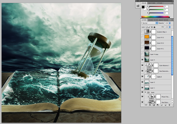
I found this tutorial on StumbleUpon.com, teaching us how to make a story book come to life. But I don't want to do the same thing as the tutorial does. So I follow some of the steps, and created something different on my own.

For more details regarding this tutorial, visit:

As I was thinking about what concept I am going to use for this picture, I thought about the recent earthquake in Japan. And a question regarding human's knowledge, nature, and time comes to my mind. Does human's knowledge help us to overcome the disasters of nature in a certain amount of time? Or does human's knowledge assist the nature to destroy the human culture over time?

The photos I use in this picture are:


Here is the way I do it:
1. First, create a new document in Photoshop.
2. Open the Stormy Sea picture. Select the sky with Rectangular Marquee tool and drag it to the new document. And rescale it.
3. Open the Earth Crack picture. Select the ground with and drag it to the new document. And rescale it.
3. Add adjustment layers of Hue/Saturation, Photo Filter, and Color Balance as clipping mask to make the color of the ground look more suitable to the sky.
4. Open the Book picture, select the book out and drag it to the new document. And rescale it.
5. To make some shadow under the book, create a new layer, and put it under the Book's layer. Use a black brush to brush the ground area around the book. And the Burn tool to brush the area on the side of the page. 
6. Since the book looks too yellow for the whole environment, I add two adjustment layer (Hue/Saturation and Photo Filter) as clipping mask to adjust the book's color.
7. To add the sea onto the page, I select the sea from the Stormy Sea picture and drag it on top of the book, and resize it. Change the Opacity of the layer as 40%, so you can see where the edges of the page are, and select the page out. 
8. Make a layer copy after selecting the page. Remove the visibility of the previous layer. And make the current layer Opacity as 100%. Then, liquify the middle part of the sea layer to make it blend in with the book's shape. 
9. Open the Hour Glass picture, select the hour glass, drag it on top of the new document, and rescale it. Use the Eraser Tool to erase the lower part of the hour glass, so it looks more like in to the sea. Also erase the glass with a light opacity brush, so you can see through the sky and sea in the back.
10. To make the hour glass look more suitable for the environment, add adjustment layers (Hue/Saturation and Color Balance) as clipping mask to adjust the color of the hour glass.
11. Make a comp layer. In order to the lighting of everything consistent, apply the Dodge Tool to lighten the area that the light shines on, and the Burn Tool to darken the area that supposed to be shadow. 
12. Make a copy of the layer. Fix the rest of the highlight areas with the Burn Tool. Also add a vignette with Lens Correction.
13. Add some Color Fill layers, Gradient Map layer, and Curve Adjustment layer to enhance the colors of the whole picture.
14. Sharpen the whole picture, so it has more dramatic feeling to it.


DONE: